See the Canonical Correlation chapter for more information.
CART. CART is a classification tree program developed by Breiman et. al. (1984). For a discussion of CART see Computation Methods in the Classification Trees chapter.
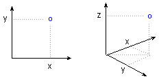
Cartesian Coordinates. Cartesian coordinates (x, y, or x, y, z; also known as rectangular coordinates) are directed distances from two (or three) perpendicular axes.
The location of a point in space is established by the corresponding coordinates on the X-and Y-axes (or X-, Y- , and Z-axes).
See also, Polar Coordinates.
Casewise MD Deletion. When casewise deletion of missing data is selected, then only cases that do not contain any missing data for any of the variables selected for the analysis will be included in the analysis. In the case of correlations, all correlations are calculated by excluding cases that have missing data for any of the selected variables (all correlations are based on the same set of data).
See also, Casewise vs. pairwise deletion of missing data
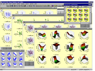
Categorized Graphs (also, Trellis Graphs). This type of graph allows you to categorize 2D, 3D, or nD plots by the specified categories of a selected variable. One component graph is produced for each level of the grouping variable (or user-defined subset of data) and all the component graphs are arranged in one display to allow for comparisons between the subsets of data (categories). For a detailed discussion of Categorized Graphs, see Categorized Graphs in Selected Topics in Graphical Analytic Techniques, see also Data Mining.
Categorized Plots, 2D - Detrended Probability Plots. This categorized plot is constructed in the same way as the standard normal probability plot for the categorized values, except that before the plot is generated, the linear trend is removed. This often "spreads out" the plot, thereby allowing the user to detect patterns of deviations more easily.
For a detailed discussion of Categorized Graphs, see Categorized Graphs in Selected Topics in Graphical Analytic Techniques.
Categorized Plots, 2D - Half-Normal Probability Plots.
The categorized half-normal probability plot is constructed in the same manner as the standard normal probability plot, except that only the positive half of the normal curve is considered. Consequently, only positive normal values will be plotted on the Y-axis. This plot is often used in plots of residuals (e.g., in multiple regression), when one wants to ignore the sign of the residuals, that is, when one is interested in the distribution of absolute residuals, regardless of the sign.
For a detailed discussion of Categorized Graphs, see Categorized Graphs in Selected Topics in Graphical Analytic Techniques.
Categorized Plots, 2D - Normal Probability Plots. This type of probability plot is constructed as follows. First, within each category, the values (observations) are rank ordered. From these ranks one can compute z values (i.e., standardized values of the normal distribution) based on the assumption that the data come from a normal distribution (see Computation Note). These z values are plotted on the Y-axis in the plot. If the observed values (plotted on the X-axis) are normally distributed, then all values should fall onto a straight line. If the values are not normally distributed, then they will deviate from the line. Outliers may also become evident in this plot. If there is a general lack of fit, and the data seem to form a clear pattern (e.g., an S shape) around the line, then the variable may have to be transformed in some way (e.g., a log transformation to "pull-in" the tail of the distribution, etc.) before some statistical techniques that are affected by non-normality can be used.
For a detailed discussion of Categorized Graphs, see Categorized Graphs in Selected Topics in Graphical Analytic Techniques.
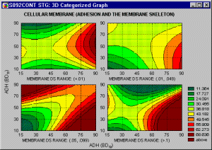
Categorized Plots, 3D - Contour Plot. This type of graph projects a 3-dimensional surface onto a 2-dimensional plane as contour plots for each level of the grouping variable. The plots are arranged in one display to allow for comparisons between the subsets of data (categories).
For a detailed discussion of Categorized Graphs, see Categorized Graphs in Selected Topics in Graphical Analytic Techniques.
Categorized Plots, 3D - Deviation Plot. Data points (representing the X, Y and Z coordinates of each point) in this graph are represented in 3D space as "deviations" from a specified base- level of the Z-axis. One component graph is produced for each level of the grouping variable (or user-defined subset of data) and all the component graphs are arranged in one display to allow for comparisons between the subsets of data (categories).
For a detailed discussion of Categorized Graphs, see Categorized Graphs in Selected Topics in Graphical Analytic Techniques.
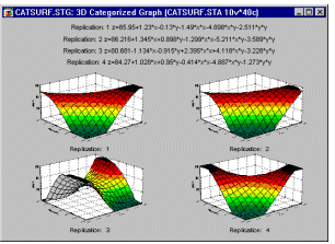
Categorized Plots, 3D - Scatterplot. This type of graphs visualizes a relationship between three variables (representing the X, Y, and one or more Z [vertical] coordinates of each point in 3- dimensional space) categorized by a grouping variable. One component graph is produced for each level of the grouping variable (or user-defined subset of data) and all the component graphs are arranged in one display to allow for comparisons between the subsets of data (categories) (see graph number 1, below).
For a detailed discussion of Categorized Graphs, see Categorized Graphs in Selected Topics in Graphical Analytic Techniques. See also, Data Reduction.
Categorized Plots, 3D - Space Plot. This type of graph offers a distinctive means of representing 3D scatterplot data through the use of a separate X-Y plane positioned at a user-selectable level of the vertical Z-axis (which "sticks up" through the middle of the plane). The level of the X-Y plane can be adjusted in order to divide the X-Y-Z- space into meaningful parts (e.g., featuring different patterns of the relation between the three variables) (see graph number 2, above).
For a detailed discussion of Categorized Graphs, see Categorized Graphs in Selected Topics in Graphical Analytic Techniques.
Categorized Plots, 3D - Spectral Plot. This type of graph produces multiple spectral plots (for subsets of data determined by the selected categorization method) arranged in one display to allow for comparisons between the subsets of data. Values of variables X and Z are interpreted as the X- and Z-axis coordinates of each point, respectively; values of variable Y are clustered into equally-spaced values, corresponding to the locations of the consecutive spectral planes (see graph number 3, above).
For a detailed discussion of Categorized Graphs, see Categorized Graphs in Selected Topics in Graphical Analytic Techniques.
Categorized Plots, 3D - Surface Plot. In this type of graph , a surface (defined by a smoothing technique or user-defined mathematical expression) is fitted to the categorized data (variables corresponding to sets of XYZ coordinates, for subsets of data determined by the selected categorization method) arranged in one display to allow for comparisons between the subsets of data (categories).
For a detailed discussion of Categorized Graphs, see Categorized Graphs in Selected Topics in Graphical Analytic Techniques.
Categorized Contour/Areas (Ternary graph). This 3D Categorized Plot projects a 3-dimensional surface onto a 2-dimensional plane as area contour plots for each level of the grouping variable. One component graph is produced for each level of the grouping variable (or user-defined subset of data) and all the component graphs are arranged in one display to allow for comparisons between the subsets of data (categories).
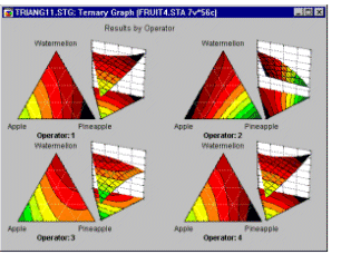
For a detailed discussion of Categorized Graphs, see Categorized Graphs in Selected Topics in Graphical Analytic Techniques.
Categorized Contour/Lines (Ternary graph). This 3D Categorized Plot projects a 3-dimensional surface onto a 2-dimensional plane as line contour plots for each level of the grouping variable. One component graph is produced for each level of the grouping variable (or user-defined subset of data) and all the component graphs are arranged in one display to allow for comparisons between the subsets of data (categories).
For a detailed discussion of Categorized Graphs, see Categorized Graphs in Selected Topics in Graphical Analytic Techniques.
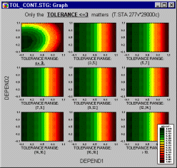
Categorizing, Grouping, Slicing, Drilling-down. One of the most important, general, and also powerful analytic methods involves dividing ("splitting") the data set into categories in order compare the patterns of data between the resulting subsets. This common technique is known under a variety of terms (such as breaking down, grouping, categorizing, splitting, slicing, drilling-down, or conditioning) and it is used both in exploratory data analyses and hypothesis testing. For example: A positive relation between the age and the risk of a heart attack may be different in males and females (it may be stronger in males). A promising relation between taking a drug and a decrease of the cholesterol level may be present only in women with a low blood pressure and only in their thirties and forties. The process capability indices or capability histograms can be different for periods of time supervised by different operators. The regression slopes can be different in different experimental groups.
There are many computational techniques that capitalize on grouping and that are designed to quantify the differences that the grouping will reveal (e.g., ANOVA/MANOVA). However, graphical techniques (such as categorized graphs) offer unique advantages that cannot be substituted by any computational method alone: they can reveal patterns that cannot be easily quantified (e.g., complex interactions, exceptions, anomalies) and they provide unique, multidimensional, global analytic perspectives to explore or mine the data.
Cauchy Distribution. The Cauchy distribution (the term first used by Upensky, 1937) has density function:
f(x) = 1/(
 *{1 + [(x-
 )/]2})
0 <
where
is the location parameter (median)
is the scale parameter
is the constant Pi (3.14...)
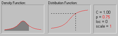
The animation above shows the changing shape of the Cauchy distribution when the location parameter equals 0 and the scale parameter equals 1, 2, 3, and 4.
Censoring (Censored Observations). Observations are referred to as censored when the dependent variable of interest represents the time to a terminal event, and the duration of the study is limited in time. Although the concept was developed in the biomedical research, censored observations may occur in a number of different areas of research. For example, in the social sciences we may study the "survival" of marriages, high school drop-out rates (time to drop-out), turnover in organizations, etc. In each case, by the end of the study period, some subjects probably will still be married, will not have dropped out, or will still be working at the same company; thus, those subjects represent censored observations.
In economics we may study the "survival" of new businesses or the "survival" times of products such as automobiles. In quality control research, it is common practice to study the "survival" of parts under stress (failure time analysis).
Data sets with censored observations can be analyzed via Survival Analysis or via Weibull and Reliability/Failure Time Analysis.
See also, Type I and II Censoring, Single and Multiple Censoring and Left and Right Censoring.
CHAID. CHAID is a classification trees program developed by Kass (1980) that performs multi-level splits when computing classification trees. For discussion of the differences of CHAID from other classification tree programs, see A Brief Comparison of Classification Tree Programs.
Characteristic Life.
In Weibull and Reliability/Failure Time Analysis the characteristic life is defined as the point in time where 63.2 percent of the population will have failed; this point is also equal to the respective scale parameter b of the two-parameter Weibull distribution (with  = 0; otherwise it is equal to b+).
Chi-square Distribution. The Chi-square distribution is defined by:
f(x) = {1/[2 /2 *
/2 *  (/2)]} * [x(/2)-1 * e-x/2]
= 1, 2, ..., 0 < x
where
is the degrees of freedom
e is the
base of the natural logarithm, sometimes called Euler's e (2.71...)
(gamma) is the Gamma function
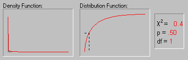
The above animation shows the shape of the Chi-square distribution as the degrees of freedom increase (1, 2, 5, 10, 25 and 50).
| 1.00 0.80 0.60 0.40 0.20 0.40 0.60 0.80 |
1.00 0.80 0.60 0.40 0.20 0.40 0.60 |
1.00 0.80 0.60 0.40 0.20 0.40 |
1.00 0.80 0.60 0.40 0.20 |
1.00 0.80 0.60 0.40 |
1.00 0.80 0.60 |
1.00 0.80 |
1.00 |
Circumplex is a special case of a more general concept of radex, developed by Louis Guttman (who contributed a number of innovative ideas to the theory of multidimensional scaling and factor analysis, Guttman, 1954).
City-Block Error Function in Neural Networks. Defines the error between two vectors as the sum of the differences in each component. Less sensitive to outliers than sum-squared, but usually causes poorer training performance (see Bishop, 1995).
See also the chapter on neural networks.
City-block (Manhattan) distance. A distance measure computed as the average difference across dimensions. In most cases, this distance measure yields results similar to the simple Euclidean distance. However, note that in this measure, the effect of single large differences (outliers) is dampened (since they are not squared). See, Cluster Analysis.
Classification. Assigning data (i.e., cases or observations) cases to one of a fixed number of possible classes (represented by a nominal output variable).
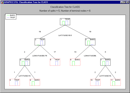
Classification Trees.
Classification trees are used to predict membership of cases or objects in the classes of a categorical dependent variable from their measurements on one or more predictor variables.
For a detailed description of classification trees, see the Classification Trees chapter.
Cluster Analysis.
The term cluster analysis (first used by Tryon, 1939) actually encompasses a number of different classification algorithms which can be used to develop taxonomies (typically as part of exploratory data analysis). For example, biologists have to organize the different species of animals before a meaningful description of the differences between animals is possible. According to the modern system employed in biology, man belongs to the primates, the mammals, the amniotes, the vertebrates, and the animals. Note how in this classification, the higher the level of aggregation the less similar are the members in the respective class. Man has more in common with all other primates (e.g., apes) than it does with the more "distant" members of the mammals (e.g., dogs), etc. For information on specific types of cluster analysis methods, see Joining (Tree Clustering), Two-way Joining (Block Clustering), and K-means Clustering.
See the Cluster Analysis chapter for more general information; see also the Classification Trees chapter.
Cluster Diagram in Neural Networks.
A scatter diagram plotting cases belonging to various classes in two dimensions. The dimensions are provided by the output levels of units in the neural network. See also, Cluster Analysis.
Codes.
Codes are values of a grouping variable (e.g., 1, 2, 3, ... or MALE, FEMALE) which identify the levels of the grouping variable in an analysis. Codes can either be text values or integer values.
Coefficient of Determination.
This is the square of the product-moment correlation between two variables (r�). It expresses the amount of common variation between the two variables.
See also, Hays, 1988.
Columns (Box Plot).
In this type of box plot, vertical columns are used to represents the variable's midpoint (i.e., mean or median). The whiskers superimposed on each column mark the selected range (i.e., standard error, standard deviation, min-max, or constant) around the midpoint.
Communality.
In Principal Components and Factor Analysis, communality is the proportion of variance that each item has in common with other items. The proportion of variance that is unique to each item is then the respective item's total variance minus the communality. A common starting point is to use the squared multiple correlation of an item with all other items as an estimate of the communality (refer to Multiple Regression for details about multiple regression). Some authors have suggested various iterative "post- solution improvements" to the initial multiple regression communality estimate; for example, the so-called MINRES method (minimum residual factor method; Harman & Jones, 1966) will try various modifications to the factor loadings with the goal to minimize the residual (unexplained) sums of squares.
Complex Numbers.
Complex numbers are the superset that includes all real and imaginary numbers. A complex number is usually represented by the expression a + ib where a and b are real numbers and i is the imaginary part of the expression where i has the property that i**2=-1.
See also, Cross-spectrum Analysis in Time Series.
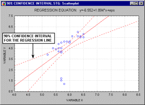
Confidence Interval.
The confidence intervals for specific statistics (e.g., means, or regression lines) give us a range of values around the statistic where the "true" (population) statistic can be expected to be located (with a given level of certainty, see also Elementary Concepts).
For example, the animation above shows a 90%, 95% and 99% confidence interval for the regression line.
Confidence Interval for the Mean.
The confidence intervals for the mean give us a range of values around the mean where we expect the "true" (population) mean is located (with a given level of certainty, see also Elementary Concepts). In some statistics or math software packages (e.g., in STATISTICA) you can
request confidence intervals for any p-level; for example, if the mean in your sample is 23, and the lower and upper limits of the p=.05 confidence interval are 19 and 27 respectively, then you can conclude that there is a 95% probability that the population mean is greater than 19 and lower than 27. If you set the p-level to a smaller value, then the interval would become wider thereby increasing the "certainty" of the estimate, and vice versa; as we all know from the weather forecast, the more "vague" the prediction (i.e., wider the confidence interval), the more likely it will materialize. Note that the width of the confidence interval depends on the sample size and on the variation of data values. The calculation of confidence intervals is based on the assumption that the variable is normally distributed in the population. This estimate may not be valid if this assumption is not met, unless the sample size is large, say n = 100 or more.
Confidence limits.
The same as Confidence Intervals. In Neural Networks, they represent the accept and reject thresholds, used in classification tasks, to determine whether a pattern of outputs corresponds to a particular class or not. These are applied according to the conversion function of the output variable (One-of-N, Two-state, Kohonen, etc).
Confusion Matrix in Neural Networks.
A name sometimes given to a matrix, in a classification problem, displaying the numbers of cases actually belonging to each class, and assigned by the neural network to that or other classes. Displayed as classification statistics in STATISTICA Neural Networks.
Conjugate Gradient Descent.
A fast training algorithm for multilayer perceptrons which proceeds by a series of line searches through error space. Succeeding search directions are selected to be conjugate (non-interfering); see Bishop, 1995.
Contour/Discrete Raw Data Plot.
This sequential plot can be considered to be a 2D projection of the 3D Ribbons plot. Each data point in this plot is represented as a rectangular region, with different colors and/or patterns corresponding to the values (or range of values of the data points (the ranges are described in the legend). Values within each series are presented along the X-axis, with each series plotted along the Y-axis.
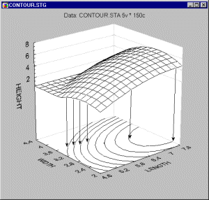
Contour Plot.
A contour plot is the projection of a 3-dimensional surface onto a 2-dimensional plane.
As compared to surface plots, they may be less effective to quickly visualize the overall shape of 3D data structures,
however, their main advantage is that they allow for precise examination and analysis of the shape of the surface (Contour Plots display a series of undistorted horizontal "cross sections" of the surface).
Cook's distance.
This is another measure of impact of the respective case on the regression equation. It indicates the difference between the computed B values and the values one would have obtained, had the respective case been excluded. All distances should be of about equal magnitude; if not, then there is reason to believe that the respective case(s) biased the estimation of the regression coefficients.
See also, standard residual value, Mahalanobis distance, and deleted residual.
Correlation.
Correlation is a measure of the relation between two or more variables. Correlation coefficients can range from -1.00 to +1.00. The value of -1.00 represents a perfect negative correlation while a value of +1.00 represents a perfect positive correlation. A value of 0.00 represents a lack of correlation.
See also, Correlation, Partial Correlation, Pearson Correlation and Spurious Correlations.
Correspondence Analysis.
Correspondence analysis is a descriptive/exploratory technique designed to analyze simple two-way and multi-way tables containing some measure of correspondence between the rows and columns. The results provide information which is similar in nature to those produced by Factor Analysis techniques, and they allow one to explore the structure of categorical variables included in the table. The most common kind of table of this type is the two-way frequency crosstabulation table (see, for example, the Basic Statistics or Log-Linear chapter).
See the Correspondence Analysis chapter for more information.
Potential capability (Cp). This is the simplest and most straightforward indicator of process capability. It is defined as the ratio of the specification range to the process range; using � 3 sigma limits we can express this index as:
Cp = (USL-LSL)/(6*Sigma)
Put into words, this ratio expresses the proportion of the range of the normal curve that falls within the engineering specification limits (provided that the mean is on target, that is, that the process is centered).
Non-centering correction (K). We can correct Cp for the effects of non-centering. Specifically, we can compute:
K = abs(Target Specification - Mean)/(1/2(USL-LSL))
This correction factor expresses the non-centering (target specification minus mean) relative to the specification range.
Demonstrated excellence (Cpk). Finally, we can adjust Cp for the effect of non-centering by computing:
Cpk = (1-k)*Cp
If the process is perfectly centered, then k is equal to zero, and Cpk is equal to Cp. However, as the process drifts from the target specification, k increases and Cpk becomes smaller than Cp.
Capability ratio (Cr). This index is equivalent to Cp; specifically, it is computed as 1/Cp (the inverse of Cp).
Estimate of sigma. When the data set consists of multiple samples, such as data collected for the quality control chart, then one can compute two different indices of variability in the data. One is the regular standard deviation for all observations, ignoring the fact that the data consist of multiple samples; the other is to estimate the process's inherent variation from the within-sample variability. When the total process variability is used in the standard capability computations, the resulting indices are usually referred to as process performance indices (as they describe the actual performance of the process; common indices are Pp, Pr, and Ppk), while indices computed from the inherent variation (within-sample sigma) are referred to as capability indices (since they describe the inherent capability of the process; common indices are Cp, Cr, and Cpk).
See Process Capability Indices and Process Capability Analysis.
Cross Entropy in Neural Networks.
Error functions based on information-theoretic measures, and particularly appropriate for classification networks. There are two versions, for single-output networks and multiple-output networks; these should be combined with the logistic and softmax activation functions respectively (Bishop, 1995). See also the chapter on neural networks.
Cross Verification in Neural Networks.
The same as Cross-Validation. In the context of neural networds, the use of an auxiliary set of data (the verification set) during iterative training. While the training set is used to adjust the network weights, the verification set maintains an independent check that the neural network is learning to generalize.
Cross-Validation.
Cross-validation refers to the process of assessing the predictive accuracy of a model in a test sample (sometimes also called a cross-validation sample) relative to its predictive accuracy in the learning sample from which the model was developed. Ideally, with a large sample size, a proportion of the cases (perhaps one-half or two-thirds) can be designated as belonging to the learning sample and the remaining cases can be designated as belonging to the test sample. The model can be developed using the cases in the learning sample, and its predictive accuracy can be assessed using the cases in the test sample. If the model performs as well in the test sample as in the learning sample, it is said to cross-validate well, or simply to cross-validate. For discussions of this type of test sample cross-validation, see the Computational Methods section of the Classification Trees chapter, the Classification section of the Discriminant Analysis chapter, and Data Mining.
A variety of techniques have been developed for performing cross-validation with small sample sizes by constructing test samples and learning samples which are partly but not wholly independent. For a discussion of some of these techniques, see the Computational Methods section of the Classification Trees chapter.
Crossed Factors.
Some experimental designs are completely crossed (factorial designs), that is, each level of each factor appears with each level of all others. For example, in a 2 (types of drug) x 2 (types of virus) design, each type of drug would be used with each type of virus.
See also, ANOVA/MANOVA.
Crosstabulations (Tables, Multi-way Tables).
A crosstabulation table is a combination of two (or more) frequency tables arranged such that each cell in the resulting table represents a unique combination of specific values of crosstabulated variables. Thus, crosstabulation allows us to examine frequencies of observations that belong to specific combinations of categories on more than one variable. For example, the following simple ("two-way") table shows how many adults vs. children selected "cookie A" vs. "cookie B" in a taste preference test:
| COOKIE: A | COOKIE: B | ||
|---|---|---|---|
| AGE: ADULT | 50 | 0 | 50 |
| AGE: CHILD | 0 | 50 | 50 |
| 50 | 50 | 100 |
For more information, see the section on Crosstabulations in the Basic Statistics chapter.