Scalable Software Systems. Software (e.g., a data base management system, such as MS SQL Server or Oracle) that can be expanded to meet future requirements without the need to restructure its operation (e.g., split data into smaller segments) to avoid a degradation of its performance. For example, a scalable network allows the network administrator to add many additional nodes without the need to redesign the basic system. An example of a non-scalable architecture is the DOS directory structure (adding files will eventually require splitting them into subdirectories). See also Enterprise-Wide Systems.
Scaling. Altering original variable values (according to a specific function or an algorithm) into a range that meet particular criteria (e.g., postive numbers, fractions, numbers less than 10E12, numbers with a large relative variance).
Scatterplot, 2D. The scatterplot visualizes a relation (correlation) between two variables X and Y (e.g., weight and height). Individual data points are represented in two-dimensional space (see below), where axes represent the variables (X on the horizontal axis and Y on the vertical axis).
The two coordinates (X and Y) that determine the location of each point correspond to its specific values on the two variables.
See also, Data Reduction.
Scatterplot, 2D - Categorized Ternary Graph. The points representing the proportions of the component variables (X, Y, and Z) in a ternary graph are plotted in a 2-dimensional display for each level of the grouping variable (or user-defined subset of data). One component graph is produced for each level of the grouping variable (or user-defined subset of data) and all the component graphs are arranged in one display to allow for comparisons between the subsets of data (categories).
See also, Data Reduction.
Scatterplot, 2D - Double-Y. This type of scatterplot can be considered to be a combination of two multiple scatterplots for one X-variable and two different sets (lists) of Y-variables. A scatterplot for the X-variable and each of the selected Y-variables will be plotted, but the variables entered into the first list (called Left-Y) will be plotted against the left-Y axis, whereas the variables entered into the second list (called Right-Y) will be plotted against the right-Y axis. The names of all Y-variables from the two lists will be included in the legend followed either by the letter (L) or (R), denoting the left-Y and right-Y axis, respectively.
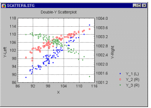
The Double-Y scatterplot can be used to compare images of several correlations by overlaying them in a single graph. However, due to the independent scaling used for the two list of variables, it can facilitate comparisons between variables with values in different ranges.
See also, Data Reduction.
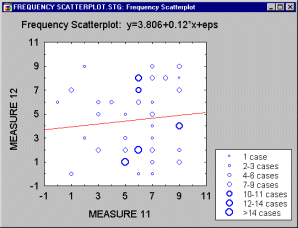
Scatterplot, 2D - Frequency. Frequency scatterplots display the frequencies of overlapping points between two variables in order to visually represent data point weight or other measurable characteristics of individual data points.
See also, Data Reduction.
Scatterplot, 2D - Multiple. Unlike the regular scatterplot in which one variable is represented by the horizontal axis and one by the vertical axis, the multiple scatterplot consists of multiple plots and represents multiple correlations: one variable (X) is represented by the horizontal axis, and several variables (Y's) are plotted against the vertical axis. A different point marker and color is used for each of the multiple Y-variables and referenced in the legend so that individual plots representing different variables can be discriminated in the graph.
The Multiple scatterplot is used to compare images of several correlations by overlaying them in a single graph that uses one common set of scales (e.g., to reveal the underlying structure of factors or dimensions in Discriminant Function Analysis).
See also, Data Reduction.
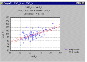
Scatterplot, 2D - Regular. The regular scatterplot visualizes a relation between two variables X and Y ( e.g., weight and height). Individual data points are represented by point markers in two- dimensional space, where axes represent the variables. The two coordinates (X and Y) which determine the location of each point, correspond to its specific values on the two variables. If the two variables are strongly related, then the data points form a systematic shape (e.g., a straight line or a clear curve). If the variables are not related, then the points form an irregular "cloud" (see the categorized scatterplot below for examples of both types of data sets).
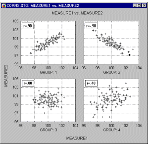
Fitting functions to scatterplot data helps identify the patterns of relations between variables (see example below).
For more examples of how scatterplot data helps identify the patterns of relations between variables, see Outliers and Brushing. See also, Data Reduction.
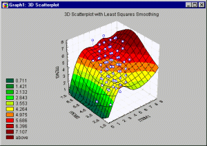
Scatterplot, 3D. 3D Scatterplots visualize a relationship between three or more variables, representing the X, Y, and one or more Z (vertical) coordinates of each point in 3-dimensional space (see graph below).
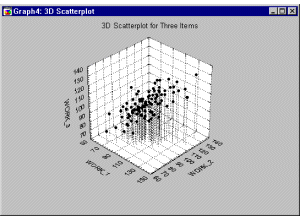
See also, 3D Scatterplot - Custom Ternary Graph, Data Reduction and Data Rotation (in 3D space).
Scatterplot, 3D - Raw Data. An unsmoothed surface (no smoothing function is applied) is drawn through the points in the 3D scatterplot.
See also, Data Reduction.Scatterplot, 3D - Ternary Graph. In this type of ternary graph, the triangular coordinate systems are used to plot four (or more) variables (the components X, Y, and Z, and the responses V1, V2, etc.) in three dimensions (ternary 3D scatterplots or surface plots). Here, the responses (V1, V2, etc.) associated with the proportions of the component variables (X, Y, and Z) in a ternary graph are plotted as the heights of the points.
See also, Data Reduction.
Scree Plot, Scree Test. The eigenvalues for successive factors can be displayed in a simple line plot. Cattell (1966) proposed that this scree plot can be used to graphically determine the optimal number of factors to retain.
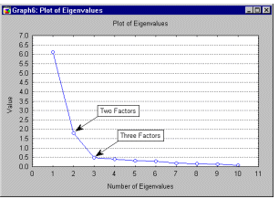
The scree test involves finding the place where the smooth decrease of eigenvalues appears to level off to the right of the plot. To the right of this point, presumably, one finds only "factorial scree" -- "scree" is the geological term referring to the debris which collects on the lower part of a rocky slope. Thus, no more than the number of factors to the left of this point should be retained.
For more information on procedures for determining the optimal number of factors to retain, see the section on Reviewing the Results of a Principal Components Analsysis in the Factor Analysis chapter and How Many Dimensions to Specify in the Multi-dimensional Scaling chapter.
Sequential Contour Plot, 3D. This contour plot presents a 2-dimensional projection of the spline-smoothed surface fit to the data (see 3D Sequential Surface Plot. Successive values of each series are plotted along the X-axis, with each successive series represented along the Y- axis.
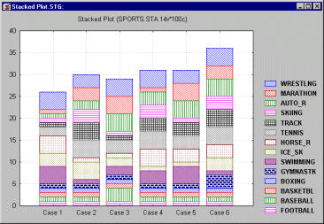
Sequential/Stacked Plots. In this type of graph, the sequence of values from each selected variable is stacked on one another.
Sequential/Stacked Plots, 2D - Area. The sequence of values from each selected variable will be represented by consecutive areas stacked on one another in this type of graph.
Sequential/Stacked Plots, 2D - Column. The sequence of values from each selected variable will be represented by consecutive segments of vertical columns stacked on one another in this type of graph.
Sequential/Stacked Plots, 2D - Lines. The sequence of values from each selected variable will be represented by consecutive lines stacked on one another in this type of graph.
Sequential/Stacked Plots, 2D - Mixed Line. In this type of graph, the sequences of values of variables selected in the first list will be represented by consecutive areas stacked on one another while the sequences of values of variables selected in the second list will be represented by consecutive lines stacked on one another (over the area representing the last variable from the first list).
Sequential/Stacked Plots, 2D - Mixed Step. In this type of graph, the sequences of values of variables selected in the first list will be represented by consecutive step areas stacked on one another while the sequences of values of variables selected in the second list will be represented by consecutive step lines stacked on one another (over the step area representing the last variable from the first list).
Sequential/Stacked Plots, 2D - Step. The sequence of values from each selected variable will be represented by consecutive step lines stacked on one another in this type of graph.
Sequential/Stacked Plots, 2D - Step Area. The sequence of values from each selected variable will be represented by consecutive step areas stacked on one another in this type of graph.
Sequential Surface Plot, 3D. In this sequential plot, a spline-smoothed surface is fit to each data point. Successive values of each series are plotted along the X-axis, with each successive series represented along the Y-axis.
Shewhart Control Charts. This is a standard graphical tool widely used in statistical Quality Control. The general approach to quality control charting is straightforward: One extracts samples of a certain size from the ongoing production process. One then produces line charts of the variability in those samples, and consider their closeness to target specifications. If a trend emerges in those lines, or if samples fall outside pre-specified limits, then the process is declared to be out of control and the operator will take action to find the cause of the problem. These types of charts are sometimes also referred to as Shewhart control charts (named after W. A. Shewhart who is generally credited as being the first to introduce these methods; see Shewhart, 1931).
For additional information, see also Quality Control charts; Assignable causes and actions.
Short Run Control Charts. The short run quality control chart , for short production runs, plots transformations of the observations of variables or attributes for multiple parts, each of which constitutes a distinct "run," on the same chart. The transformations rescale the variable values of interest such that they are of comparable magnitudes across the different short production runs (or parts). The control limits computed for those transformed values can then be applied to determine if the production process is in control, to monitor continuing production, and to establish procedures for continuous quality improvement.
Shuffle data in Neural Networks in Neural Networks. Randomly assigning cases to the training and verification sets, so that these are (as far as possible) statistically unbiased. See, Neural Networks.
Shuffle, Back Propagation in Neural Networks. Presenting training cases in a random order on each epoch, to prevent various undesirable effects which can otherwise occur (such as oscillation and convergence to local minima). See, Neural Networks.
Sigmoid function. An S-shaped curve, with a near-linear central response and saturating limits.
See also, logistic function and hyperbolic tangent function.
Simplex algorithm. A nonlinear estimation algorithm that does not rely on the computation or estimation of the derivatives of the loss function. Instead, at each iteration the function will be evaluated at m+1 points in the m dimensional parameter space. For example, in two dimensions (i.e., when there are two parameters to be estimated), the program will evaluate the function at three points around the current optimum. These three points would define a triangle; in more than two dimensions, the "figure" produced by these points is called a Simplex.
Single and Multiple Censoring. There are situations in which censoring can occur at different times (multiple censoring), or only at a particular point in time (single censoring). Consider an example experiment where we start with 100 light bulbs, and terminate the experiment after a certain amount of time. If the experiment is terminated at a particular point in time, then a single point of censoring exists, and the data set is said to be single-censored. However, in biomedical research multiple censoring often exists, for example, when patients are discharged from a hospital after different amounts (times) of treatment, and the researcher knows that the patient survived up to those (differential) points of censoring.
Data sets with censored observations can be analyzed via Survival Analysis or via Weibull and Reliability/Failure Time Analysis. See also, Type I and II Censoring and Left and Right Censoring.
Singular Value Decomposition. An efficient algorithm for optimizing a linear model.
See also, pseudo-inverse.
Skewness. Skewness (this term was first used by Pearson, 1895) measures the deviation of the distribution from symmetry. If the skewness is clearly different from 0, then that distribution is asymmetrical, while normal distributions are perfectly symmetrical.
Skewness = n*M3/[(n-1)*(n-2)* 3]
3]
where
M3 is equal to:  (xi-Meanx)3
3 is the standard deviation (sigma) raised to the third power
n is the valid number of cases.
See also, Descriptive Statistics Overview.
Smoothing. Smoothing techniques can be used in two different situations. Smoothing techniques for 3D Bivariate Histograms allow you to fit surfaces to 3D representations of bivariate frequency data. Thus, every 3D histogram can be turned into a smoothed surface providing a sensitive method for revealing non-salient overall patterns of data and/or identifying patterns to use in developing quantitative models of the investigated phenomenon.
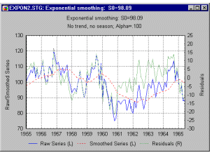
In Time Series analysis, the general purpose of smoothing techniques is to "bring out" the major patterns or trends in a time series, while de-emphasizing minor fluctuations (random noise). Visually, as a result of smoothing, a jagged line pattern should be transformed into a smooth curve.
See also, Exploratory Data Analysis and Data Mining Techniques, and Smoothing Bivariate Distributions.
SOFMs (Self-organizing feature maps; Kohonen Networks). Neural networks based on the topological properties of the human brain, also known as Kohonen Networks (Kohonen, 1982; Fausett, 1994,; Haykin, 1994; Patterson, 1996).
Softmax. A specialized activation function for one-of-N encoded classification networks. Performs a normalized exponential (i.e. the outputs add up to 1). In combination with the cross entropy error function, allows multilayer perceptron networks to be modified for class probability estimation (Bishop, 1995; Bridle, 1990). See, Neural Networks.
Space Plots. This type of graph offers a distinctive means of representing 3D Scatterplot data through the use of a separate X-Y plane positioned at a user-selectable level of the vertical Z-axis (which "sticks up" through the middle of the plane).
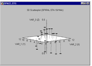
The Space Plots specific layout may facilitate exploratory examination of specific types of three-dimensional data. It is recommended to assign variables to axes such that the variable that is most likely to discriminate between patterns of relation among the other two is specified as Z.
See also, Data Rotation (in 3D space) in the Graphical Techniques chapter.
Spectral Plot. The original application of this type of plot was in the context of spectral analysis in order to investigate the behavior of non-stationary time series. On the horizontal axes one can plot the frequency of the spectrum against consecutive time intervals, and indicate on the Z-axis the spectral densities at each interval (see for example, Shumway, 1988, page 82).
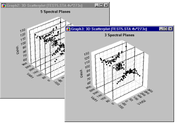
Spectral plots have clear advantages over the regular 3D Scatterplots when you are interested in examining how a relationship between two variables changes across the levels of a third variable, as is shown in the next illustration. The advantage of Spectral Plots over the regular 3D Scatterplots is well-illustrated in the comparison of the two displays of the same data set shown below.
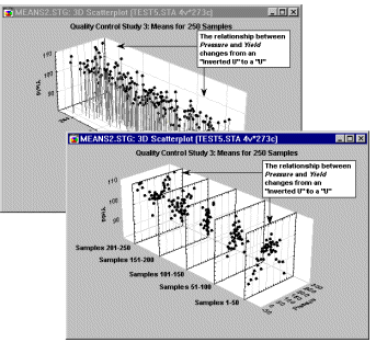
The Spectral Plot makes it easier to see that the relationship between Pressure and Yield changes from an "inverted U" to a "U".
See also, Data Rotation (in 3D space) in the Graphical Techniques chapter.
Spikes (3D graphs). In this type of graph, individual values of one or more series of data are represented along the X-axis as a series of "spikes" (point symbols with lines descending to the base plane). Each series to be plotted is spaced along the Y-axis. The "height" of each spike is determined by the the respective value of each series.
Spline (2D graphs). A curve is fitted to the XY coordinate data using the bicubic spline smoothing procedure.
Spline (3D graphs). A surface is fitted to the XYZ coordinate data using the bicubic spline smoothing procedure.
Split Selection (for Classification Trees). Split selection for classification trees refers to the process of selecting the splits on the predictor variables which are used to predict membership in the classes of the dependent variable for the cases or objects in the analysis. Given the hierarchical nature of classification trees, these splits are selected one at time, starting with the split at the root node, and continuing with splits of resulting child nodes until splitting stops, and the child nodes which have not been split become terminal nodes.
The split selection process is described in the Computational Methods section of the Classification Trees chapter.
Spurious Correlations. Correlations that are due mostly to the influences of one or more "other" variables. For example, there is a correlation between the total amount of losses in a fire and the number of firemen that were putting out the fire; however, what this correlation does not indicate is that if you call fewer firemen then you would lower the losses. There is a third variable (the initial size of the fire) that influences both the amount of losses and the number of firemen. If you "control" for this variable (e.g., consider only fires of a fixed size), then the correlation will either disappear or perhaps even change its sign. The main problem with spurious correlations is that we typically do not know what the "hidden" agent is. However, in cases when we know where to look, we can use partial correlations that control for (i.e., partial out) the influence of specified variables.
See also Correlation, Partial Correlation, Basic Statistics, Multiple Regression, Structural Equation Modeling (SEPATH).
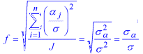
Square Root of the Signal to Noise Ratio (f). This standardized measure of effect size is used in the Analysis of Variance to characterize the overall level of population effects, and is very similar to the RMSSE. It is the square root of the sum of squared standardized effects divided by the number of effects. For example, in a 1-Way ANOVA, with J groups, f is calculated as
For more information see the chapter on Power Analysis.
Standard Deviation. The standard deviation (this term was first used by Pearson, 1894) is a commonly-used measure of variation. The standard deviation of a population of values is computed as:
= [(xi-µ)2/N]1/2
where
µ is the population mean
N is the population size.
The sample estimate of the population standard deviation is computed as:
s = [(xi-x-bar)2/n-1]1/2
where
xbar is the sample mean
n is the sample size.
See also, Descriptive Statistics Overview.
Standard Error of the Mean. The standard error of the mean (first used by Yule, 1897) is the theoretical standard deviation of all sample means of size n drawn from a population and depends on both the population variance (sigma) and the sample size (n) as indicated below:
 = (2/n)1/2
where
= (2/n)1/2
where
2 is the population variance and
n is the sample size.
Since the population variance is typically unknown, the best estimate for the standard error of the mean is then calculated as:
 = (s2/n)1/2
where
s2 is the sample variance (our best estimate of the population variance) and
n is the sample size.
See also, Descriptive Statistics Overview.
Standard Error of the Proportion.
This is the standard deviation of the distribution of the sample proportion over repeated samples. If the population proportion is  , and the sample size is N, the standard error of the proportion when sampling from an infinite population is
sp = (p(1-p)/N)**1/2
For more information see the chapter on Power Analysis.
Standard residual value. This is the standardized residual value (observed minus predicted divided by the square root of the residual mean square).
See also, Mahalanobis distance, deleted residual and Cook�s distance.
Standardized DFFITS. This is another measure of impact of the respective case on the regression equation. The formula for standardized DFFITS is
SDFITi = DFFITi/(si( i)1/2)
where hi is the leverage for the ith case
i)1/2)
where hi is the leverage for the ith case
and
i = 1/N + hi
See also, DFFITS, studentized residuals, and studentized deleted residuals. For more information see Hocking (1996) and Ryan (1997).
Standardized Effect (Es). A statistical effect expressed in convenient standardized units. For example, the standardized effect in a 2 Sample t-test is the difference between the two means, divided by the standard deviation, i.e.,
Es = (µ1 - µ2)/s
For more information see the chapter on Power Analysis.
Stationary Series (in Time Series). In Time Series analysis, a stationary series has a constant mean, variance, and autocorrelation through time (i.e., seasonal dependencies have been removed via Differencing).
Statistical Power. The probability of rejecting a false statistical null hypothesis.
For more information see the chapter on Power Analysis.
Statistical Significance (p-level). The statistical significance of a result is an estimated measure of the degree to which it is "true" (in the sense of "representative of the population"). More technically, the value of the p-level represents a decreasing index of the reliability of a result. The higher the p-level, the less we can believe that the observed relation between variables in the sample is a reliable indicator of the relation between the respective variables in the population. Specifically, the p-level represents the probability of error that is involved in accepting our observed result as valid, that is, as "representative of the population." For example, the p-level of .05 (i.e.,1/20) indicates that there is a 5% probability that the relation between the variables found in our sample is a "fluke." In other words, assuming that in the population there was no relation between those variables whatsoever, and we were repeating experiments like ours one after another, we could expect that approximately in every 20 replications of the experiment there would be one in which the relation between the variables in question would be equal or stronger than in ours. In many areas of research, the p-level of .05 is customarily treated as a "border-line acceptable" error level.
See also, Elementary Concepts.
Steepest Descent Iterations. When initial values for the parameters are far from the ultimate minimum, the approximate Hessian used in the Gauss-Newton procedure may fail to yield a proper step direction during iteration. In this case, the program may iterate into a region of the parameter space from which recovery (i.e., successful iteration to the true minimum point) is not possible. One option offered by Structural Equation Modeling is to precede the Gauss-Newton procedure with a few iterations utilizing the "method of steepest descent." In the steepest descent approach, values of the parameter vector q on each iteration are obtained as
 k+1 = k +
  kgk
kgk
In simple terms, what this means is that the Hessian is not used to help find the direction for the next step. Instead, only the first derivative information in the gradient is used.
Hint for beginners. Inserting a few Steepest Descent Iterations may help in situations where the iterative routine "gets lost" after only a few iterations.
Steps. Repetitions of a particular analytic or computational operation or procedure. For example in the neural network time series analysis, the number of consecutive time steps from which input variable values should be drawn to be fed into the neural network input units.
Stopping Conditions. During an iterative process (e.g., fitting, searching, training), the conditions which must be true for the process to stop. (For example, in neural networks, the stopping conditions include the maximum number of epochs, target error performance and the minimum error improvement thresholds.
Stopping Rule (in Classification Trees). The stopping rule for a classification tree refers to the criteria that are used for determining the "right-sized" classification tree, that is, a classification tree with an appropriate number of splits and optimal predictive accuracy. The process of determining the "right-sized" classification tree is described in the Computational Methods section of the Classification Trees chapter.
Stub and Banner Tables (Banner Tables). Stub-and-banner tables are essentially two-way tables, except that two lists of categorical variables (instead of just two individual variables) are crosstabulated. In the Stub-and-banner table, one list will be tabulated in the columns (horizontally) and the second list will be tabulated in the rows (vertically) of the Scrollsheet.
For more information, see the Stub and Banner Tables section of the Basic Statistics chapter.
Student's t Distribution.
The Student's t distribution has density function (for  = 1, 2, ...):
f(x) =  [( [( +1)/2] / (/2) * (* +1)/2] / (/2) * (* )-1/2 * )-1/2 * |
| [1 + (x2/)-(+1)/2
|
where
is the degrees of freedom
(gamma) is the Gamma function
is the constant Pi (3.14...)
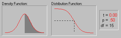
The animation above shows various tail areas (p-values) for a Student's t distribution with 15 degrees of freedom.
Studentized Deleted Residuals. In addition to standardized residuals several methods (including studentized residuals, studentized deleted residuals, DFFITS, and standardized DFFITS) are available for detecting outlying values (observations with extreme values on the set of predictor variables or the dependent variable). The formula for studentized deleted residuals is given by
SDRESIDi = DRESIDi/ s(i)
for
DRESID = ei/(1-i )
and where
s(i) = 1/(C-p-1)1/2 * ((C-p)s2/1-hi) - DRESIDi2)1/2
ei is the error for the ith case
hi is the leverage for the ith case
p is the number of coefficients in the model
and
i = 1/N + hi
For more information see Hocking (1996) and Ryan (1997).
Studentized Residuals. In addition to standardized residuals several methods (including studentized residuals, studentized deleted residuals, DFFITS, and standardized DFFITS) are available for detecting outlying values (observations with extreme values on the set of predictor variables or the dependent variable). The formula for studentized residuals is
SRESi = (ei/s)/(1-i)1/2
where
ei is the error for the ith case
hi is the leverage for the ith case
and
i = 1/N + hi
For more information see Hocking (1996) and Ryan (1997).
Sum-squared error function. An error function composed by squaring the difference between sets of target and actual values, and adding these together (see also, loss function.
Supervised Learning in Neural Networks. Training algorithms which adjust the weights in a neural network by executing the network on input cases with known outputs, and using the error between the actual and target outputs to adjust the weights. See, Neural Networks.
Suppressor Variable. A suppressor variable (in Multiple Regression ) has zero (or close to zero) correlation with the criterion but is correlated with one or more of the predictor variables, and therefore, it will suppress irrelevant variance of independent variables. For example, you are trying to predict the times of runners in a 40 meter dash. Your predictors are Height and Weight of the runner. Now, assume that Height is not correlated with Time, but Weight is. Also assume that Weight and Height are correlated. If Height is a suppressor variable, then it will suppress, or control for, irrelevant variance (i.e., variance that is shared with the predictor and not the criterion), thus increasing the partial correlation. This can be viewed as ridding the analysis of noise.
Let t = Time, h = Height, w - Weight, rth = 0.0, rtw = 0.5, and rhw = 0.6.
Weight in this instance accounts for 25% (Rtw**2 = 0.5**2) of the variability of Time. However, if Height is included in the model, then an additional 14% of the variability of Time is accounted for even though Height is not correlated with Time (see below):
Rt.hw**2 = 0.5**2/(1 - 0.6**2) = 0.39
For more information, please refer to Pedhazur, 1982.
Surface Plot (from Raw Data). This sequential plot fits a spline-smoothed surface to each data point. Successive values of each series are plotted along the X-axis, with each successive series represented along the Y-axis.
Survival Analysis. Survival analysis (exploratory and hypothesis testing) techniques include descriptive methods for estimating the distribution of survival times from a sample, methods for comparing survival in two or more groups, and techniques for fitting linear or non-linear regression models to survival data. A defining characteristic of survival time data is that they usually include so-called censored observations, e.g., observations that "survived" to a certain point in time, and then dropped out from the study (e.g., patients who are discharged from a hospital). Instead of discarding such observations from the data analysis all together (i.e., unnecessarily loose potentially useful information) survival analysis techniques can accommodate censored observations, and "use" them in statistical significance testing and model fitting.Typical survival analysis methods include life table, survival distribution, and Kaplan-Meier survival function estimation, and additional techniques for comparing the survival in two or more groups. Finally, Survival analysis includes the use of regression models for estimating the relationship of (multiple) continuous variables to survival times.
For more information, see the Survival Analysis chapter.
Survivorship Function. The survivorship function (commonly denoted as R(t)) is the complement to the cumulative distribution function (i.e., R(t)=1-F(t)); the survivorship function is also referred to as the reliability or survival function (since it describes the probability of not failing or of surviving until a certain time t; e.g., see Lee, 1992).
For additional information see also the Survival Analysis chapter, or the Weibull and Reliability/Failure Time Analysis section in the Process Analysis chapter.
Symmetric Matrix. A matrix is symmetric if the transpose of the matrix is itself (i.e., A = A'). In other words, the lower triangle of the square matrix is a "mirror image" of the upper triangle with 1's on the diagonal (see below).
| |1 2 3 4| |2 1 5 6| |3 5 1 7| |4 6 7 1| |
Symmetrical Distribution. If you split the distribution in half at its mean (or median), then the distribution of values would be a "mirror image" about this central point.
See also, Descriptive Statistics Overview.